UX analysis of the website using the Honeycomb checklist
Have you heard that your website is the salesperson that works 24/7?
Consider this. A website should describe your company in detail and showcase your current services, products, and pricing. It should entice prospects and address all of their queries about the business.
And just like you must train and invest in your salespeople year after year, you must analyze the performance of your website over time and make any required modifications and upgrades to guarantee it continues to successfully convert visitors.
For this same reason, I was entrusted to lead an exciting project. One of our company’s WordPress websites was superannuated, so I was assigned to give it a facelift on which I worked in the past few weeks. After lots of planning, research, development, trials and errors, and testing, I successfully revamped the entire website by changing the design and applying an entirely new theme. And the result came out fantastic. The website’s new look is visually appealing.

However, as a Digital Marketer, my job is to ensure that the website provides a great user experience and is search engine optimized. Moreover, every aspect of digital marketing is becoming algorithm-driven, from social media newsfeeds to advertisements and search engine results. And unless marketers focus more on UX than SEO, their content will be less visible. Therefore, designing a beautiful-looking website with integrated SEO tricks and hacks isn’t enough. It should really offer value to the users and be easy to use.
Hence, I decided to self-analyze the website design using the principles of Honeycomb.
The UX Honeycomb
First and foremost, what is the UX Honeycomb?
Peter Morville’s User Experience Honeycomb is a classic UX diagram outlining the seven essential aspects of UX (User Experience). It is a teaching tool that explains UX basics and can also be a checklist for website designers. It defines that the website design should be
- useful
- useable
- desirable
- findable
- credible
- valuable and
- accessible

With that, let’s put the website to Honeycomb test:
The website? www.assurancemedical.com
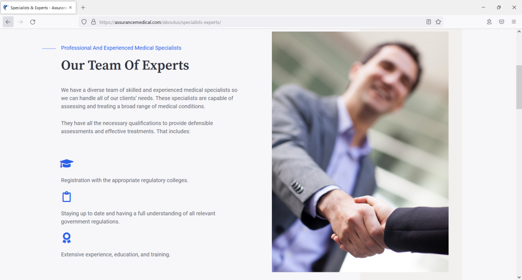
What do they do? Assurance Medical Services (AMS) provide independent medical assessments and rehabilitation services for corporations, government, law firms, and insurance companies. It consists of highly skilled and experienced professionals who offer reliable medical evaluations and personalized care.
Who are the users? Primary website users are lawyers, insurers and businesses who use desktop devices to send referrals and documents to AMS. At the same time, the secondary users are patients/assessee who mainly use their mobile devices to book services.
The honeycomb checklist:
1. Useful
The AMS website is helpful to the users as it provides all the valuable information about the independent medical assessment services. The Services and the Assessments pages give users an overview of the company’s offerings and a brief explanation of primary services. However, providing a detailed description or even FAQ about the benefits could be more helpful to users who haven’t heard about these services.
2. Usable
The AMS website is simple and easy to use. It provides a sense of familiarity. Hence, a user’s learning curve is as short and painless. It is intuitive enough for users to become experts on their first visit. For example, a user looking to send a referral can complete the entire process in 4 clicks after visiting the homepage. The user flow on this website is flawless and logical.

To avoid confusion, sending a referral is split into three broad categories so the user can clearly understand each step’s expectations and anticipate the next steps.
3. Desirable
The AMS website design is minimal and to the point. The visual aesthetics of the website, including the images, white space and icons used, are appealing. The website design evokes emotions that can result in a positive user experience. The website’s colour palette complements the brand colours and is relevant to the business’s nature.
4. Findable
The navigation menu and search bar are readily available at the top of the website if users need to use them. The website is easy to navigate using the navigation menu, allowing visitors to access the most helpful pages quickly. The links to all the necessary pages are in the header menu, while other pages are accessible from the footer menu. The contents within the website are also easily findable utilizing the search feature.

5. Credible
To make the website trustworthy, I ensured that the company landline phone number was above the fold on the homepage. The contact us page also includes the complete physical address of the business and Google maps directions, which assure the users that they are on the official website rather than a fraudulent one.

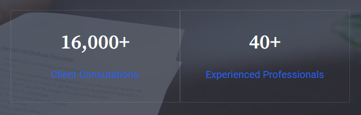
The presence of Privacy Policy and Terms of Service pages reinforces credibility. The privacy policy page, for example, includes information as to how the website will utilize user data. The Client testimonials on the homepage also help add to the website’s credibility.
All this leads users to believe that they will achieve their goal satisfactorily when they reach the end of their user journey.
6. Valuable
The AMS website successfully delivers value to its users. At the end of their user journey, users can accomplish their purpose of visiting the website by finding valuable information, sending referrals or booking appointments. Overall, the website helps improve customer satisfaction.
7. Accessible
The design of the AMS website is such that users with disabilities can have the same user experience as everyone else. The colour contrast has been used effectively throughout the website, and images also have alternative text. However, the analysis from Webaim.org found 28 contrast errors on the homepage. Hence there is a scope of improvement in text colour contrast on a background image which can help people with low vision and colour blindness.
To wrap up..
By using the Honeycomb checklist, I was able to go beyond the obvious and determine what else needed to be done. But it doesn’t end there because the user experience is only great if it helps you reach your goals, especially the ability of your site to convert visitors into leads. And to achieve that, it is also essential to perform usability tests of the site, talk to the audience, see what they interact with more, find out what sections they find helpful and the ones they find distracting, and then tweak your site accordingly- which will my next step.
Hope you found this post helpful and enjoyed reading it. Why not share on social media using the super-easy share buttons below!

Leave a Reply